In a previous post, I wrote about three kinds of item-total regressions available in dexter: the empirical one, and the smoothed versions under the Rasch model and the interaction model. In fact, there is one more item-total regression, available through the distractor_plot command and the Shiny interfaces in dexter and dextergui. This will be the topic today.
Unlike the latter two regressions, this one does not involve a global model for the data (Rasch or interaction model): it is local. We use the density function in R (R Development Core Team (2005)) to estimate the density of the total scores twice over the same support: for all persons, and for the persons who have given a certain response to the item. Together with the marginal frequency of the response, this is all we need to apply the Bayes rule and compute the density of the response given the total score. This is the item-total regression we need.
We call this a distractor plot because we apply it to all possible responses to the item, including non-response, and not just to the (modelled) correct response. This provides valuable insights into the quality of item writing, including trivial annoyances such as a wrong key. We don’t have to believe that multiple choice items are the pinnacle of creation but, if we do use them, we must make sure that they are written well and graded correctly. Good writing means, among other things, that along with the correct response(s) the item must contain a sufficient number of sufficiently plausible wrong alternatives (‘distractors’).
Moses (2017) gives a nice historical overview of the use of similar graphics, from the first item-total regressions drawn by Thurstone in 1925 to the graphs used routinely at ETS. He also provides examples (drawn from Livingston and Dorans (2004)) of items that are too easy, too difficult, or simply not appropriate for a given group of examinees. Let us also mention the computer program TestGraf98 (Ramsay (2000)) whose functionality has been reproduced in the R package, KernelSmoothIRT (Mazza, Punzo, and McGuire (2014)).
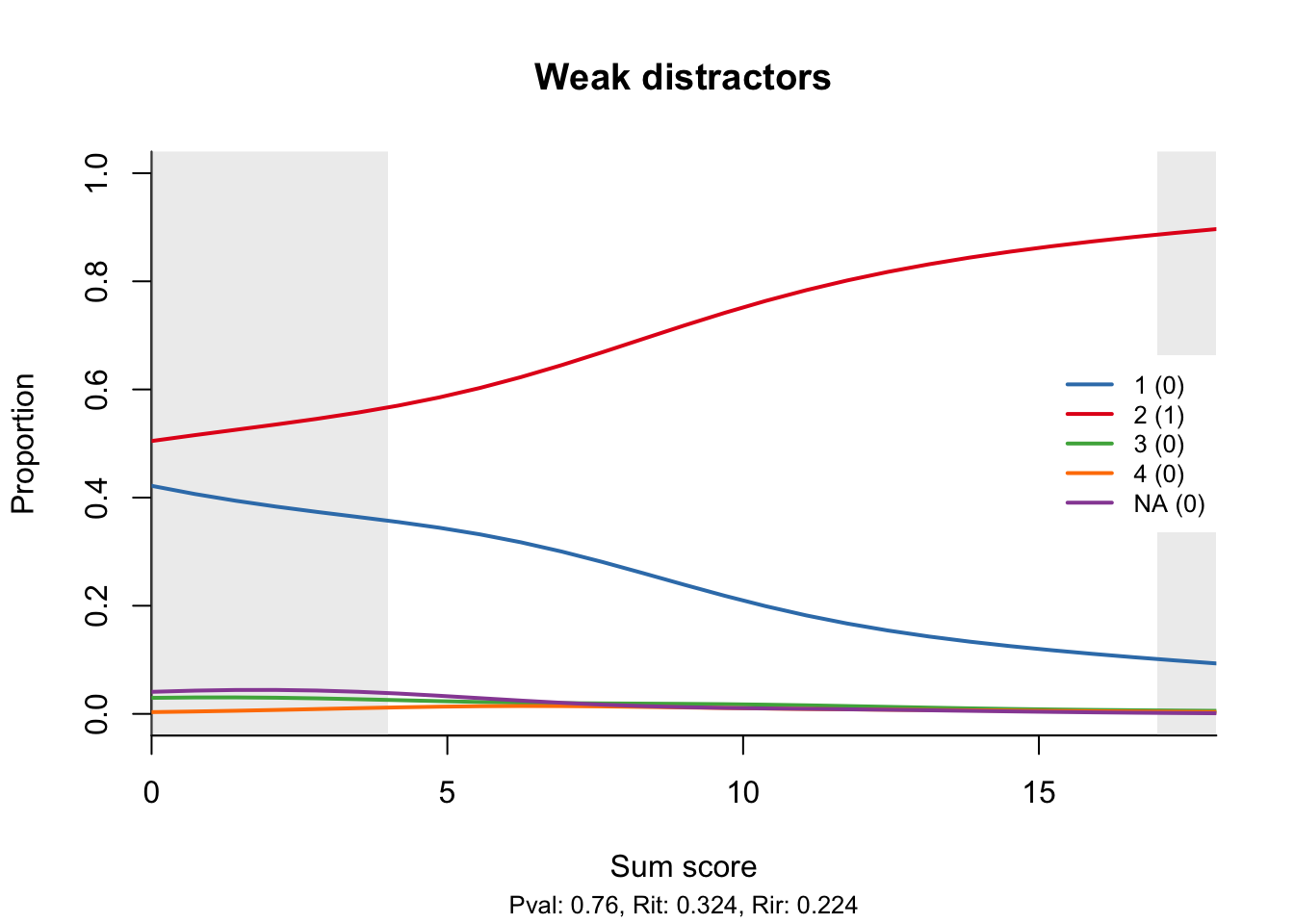
I will only give a couple of examples. The first one illustrates the situation I described above. Only one of the distractors is plausible, while the other two are so weak that nobody ever chooses them. Solving the item then turns, for the less able students, into coin flipping.

Note that the distractor plot is not a proper item-total regression in the sense that a total score of 0 does not necessarily go with an item score of zero; similar for the full score. In this respect, it resembles the trace lines of the 2PL and 3PL models. Just as with the other item-total regressions, we have provided curtains, drawn by default at the 5th and 95th percentile of the total score distribution. Most of the interesting (and statistically stable) stuff happens where the curtains are open.
My example data set does not contain any items with wrong keys, and I am too lazy to fake one, although it is not difficult: all I would need to do is use the touch_rules function. It is also easy to foresee what would happen: the curve for the correct response will have a negative slope. To help discover such cases more easily, the legend for the curves shows the original response and, in brackets, the score that it is assigned by the current scoring rules. I have already given away the recipe for correcting any wrong rules.
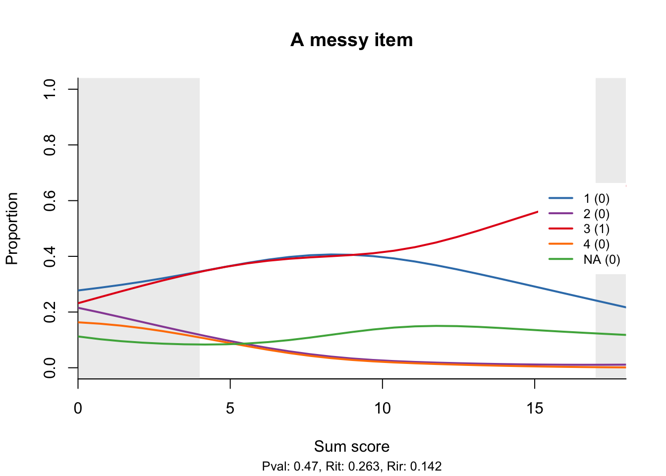
The following example is even more messy. Thankfully, the curve for the correct response is monotone increasing, but one of the distractors is possibly too attractive and peaks in the middle, a bit like the middle category in a partial credit model. Note that the rate of non-response seems to increase slightly with the total score, which I think is also a bad sign.

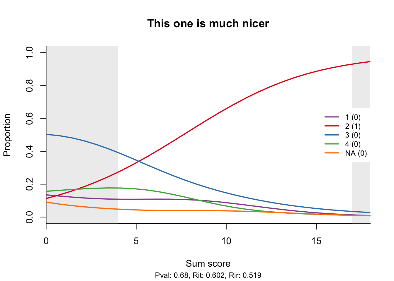
To conclude, I will show something that not everybody does: a good item.

Note the high correlations of the item score with the total score and the rest score (the total omitting the item), neatly shown at the bottom as Rit and Rir.
When an item has been included in more than one booklet, the default behaviour is to display the distractor plots side by side. The position of the item in each booklet is shown in the default plot title, which may help explain unexpected differences. For example, if an item’s difficulty is higher when the item is placed towards the end of the test, this would be a sign of speededness.
References
Livingston, Samuel A., and Neil J. Dorans. 2004. “A Graphical Approach to Item Analysis.” ETS Research Report Series, no. 1: i–17. doi:10.1002/j.2333-8504.2004.tb01937.x.
Mazza, Angelo, Antonio Punzo, and Brian McGuire. 2014. “KernSmoothIRT: An R Package for Kernel Smoothing in Item Response Theory.” Journal of Statistical Software 58 (6): 1–34. http://www.jstatsoft.org/v58/i06/.
Moses, Tim. 2017. “A Review of Developments and Applications in Item Analysis.” In Advancing Human Assessment: The Methodological, Psychological and Policy Contributions of ETS, edited by M. von Davier and C.H. Carstensen, 19–46. New York: Springer.
R Development Core Team. 2005. R: A Language and Environment for Statistical Computing. Vienna, Austria: R Foundation for Statistical Computing. https://www.R-project.org.
Ramsay, J. O. 2000. TestGraf: A Program for the Graphical Analysis of Multiple Choice Test and Questionnaire Data. McGill University.