Bechger and Maris (2015) pointed out that, the way DIF is defined in psychometrics, it can be more sensibly related to pairs of items than to the individual item. Starting from the idea that all relevant information can be captured in the (group-specific) distance matrix between item difficulties, I try to visualise the subtle differences between a relatively large number of such distance matrices. This is an improvised meal using products already in the fridge, instant dinner, kitchen express. I am sure it can be vastly improved.
First, how do we measure the similarity between two distance matrices? A look at the cuisine of other peoples, notably ecologists, reminds us of the Mantel test. This should not be confused with the Mantel-Haenszel statistic prominent in traditional DIF methodology: a chi-squared test testing the hypothesis that an odds-ratio between two dichotomous variables estimated across the levels of a third discrete variable is significantly different from 1. No, the Mantel test computes, simply, Pearson’s correlation between the two distance matrices, taken as vectors. What is not so simple is establish the statistical significance of the result. Distances are not independent (changing even one would distort the map), so Mantel devises a permutation-based method. I happily ignore that because I am searching for a proximity matrix, not tests of significance.
Ingredients:
- A PISA data set – I used 2012 Mathematics, available here
- An IRT program to estimate item difficulties – I have a natural preference for dexter
- An ordination technique to taste: PCA, MDS, or similar
- Bits and ends from the R kitchen
Preparation:
Start with the dexter data base used in earlier posts on this blog, and select the items asked in all countries; also, remove data from two countries where there were a couple of items with a zero score.
library(plyr)
library(dplyr)
## Warning: package 'dplyr' was built under R version 3.5.2library(dexter)
db = open_project('pisa2012.db')
resp = get_responses(db,
columns=c('person_id', 'booklet_id', 'item_id', 'item_score', 'cnt', 'in_basket')) %>%
filter(in_basket==1 & cnt!="VNM" & cnt!='JOR') Estimate the Rasch model in each country separately, using the same identification constraints; put the item difficulties (beta.cml) in a data frame:
parms = resp %>%
  group_by(cnt) %>%
  do({prm=as.data.frame(fit_enorm(.)$est$beta)})
Compute the distance matrix between all pairs of items in each country, then the correlations between each pair of distance matrices. The result is a triangular matrix – promote it to square, and add a diagonal of ones.
dimat = dlply(parms, .(cnt), function(x)dist(x$V1))

n = length(dimat)
r = matrix(0, n, n)

for (i in 1:(n-1)) {
  for (j in (i+1):n) {
    a = as.vector(dimat[[i]])
    b = as.vector(dimat[[j]])
    r[i,j] = cor(a,b)
  }
}

r = r + t(r)
diag(r) = 1
To visualise the correlation matrix, use a plot of the principal loadings with the principal components as axes. Compute the eigendecomposition and divide each eigenvector with the square root of the corresponding eigenvalue:
eig = eigen(r)
spl = sweep(eig$vectors, 2, sqrt(eig$values), "/")
All correlations are high and positive – here is the summary:
summary(as.vector(r[lower.tri(r)]))## Min. 1st Qu. Median Mean 3rd Qu. Max.
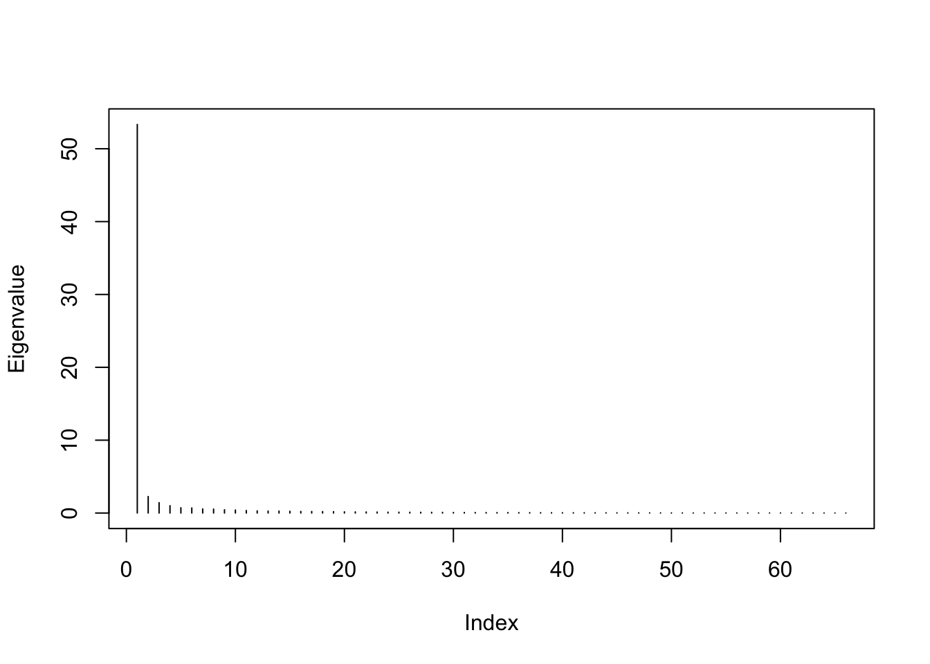
## 0.5084 0.7514 0.8134 0.8024 0.8632 0.9804Not surprisingly, there is a very strong first PC, reflecting an overwhelming measurement invariance overall:
plot(eig$values, type="h", ylab="Eigenvalue")
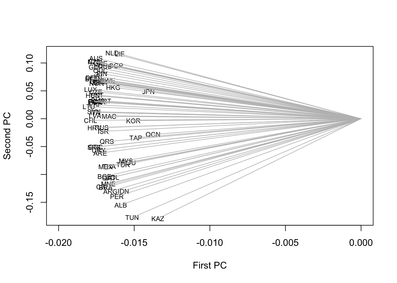
With a strongly distorted aspect ratio putting a magnifying lens to the first axis, we notice that some Asian countries like China, Japan, or Korea, have somewhat shorter arrows:
plot(spl[,1], spl[,2], ty="n", xlim=c(-0.02,0),
     xlab="First PC", ylab="Second PC")
text(spl[,1], spl[,2], names(dimat), cex=.7)
segments(0, 0, spl[,1], spl[,2], col='gray')
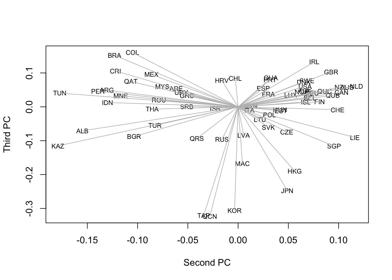
The length of the arrow represents the plot approximation to the standard deviation of a variable. Because we have a correlation matrix, a shorter arrow means less perfect representation of the variable using the first two PC. We can expect to find these countries featured on the next PC:
plot(spl[,2], spl[,3], ty="n",
     xlab="Second PC", ylab="Third PC")
text(spl[,2], spl[,3], names(dimat), cex=.7)
segments(0, 0, spl[,2], spl[,3], col='gray')
The second PC seems related to overall achievement in Mathematics, while the third one may have to do with geographic or cultural factors. As a result, European, Asian, and South American countries each appear to group together, with arrows pointing in similar directions.
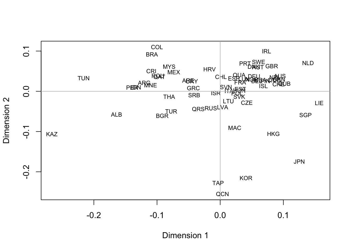
Some cooks prefer MDS, which takes a matrix of dissimilarities rather than a matrix of similarities as input. Package proxy has a handy function to translate similarities into dissimilarities:
library(proxy)## Warning: package 'proxy' was built under R version 3.5.2colnames(r) = rownames(r) = names(dimat)
d = pr_simil2dist(r)
mmds = cmdscale(d, eig=TRUE, k=2)
plot(mmds$points, type='n', xlab='Dimension 1', ylab='Dimension 2')
text(mmds$points, rownames(mmds$points), cex=.7)
abline(h=0, col='gray')
abline(v=0, col='gray')
Results are largely similar to the previous plot (or, did you expect to see something vastly different?).
References
Bechger, Timo M., and Gunter Maris. 2015. “A Statistical Test for Differential Item Pair Functioning.” Psychometrika 80 (2): 317–40.