I have been trying to explain to a bunch of psychometricians some points about singular value decomposition (SVD) and its uses in data analysis. It turned out a bit difficult – not because the points are complicated but because psychometricians seem to be imprinted with principal components analysis (PCA), one possible technique related to SVD. There are many more possibilities to explore.
The data set in which I was originally interested is a bit large and complicated, so in this tutorial I will use the famous iris data (sorry, guys). Everybody knows and loves the iris data, especially the first 100 times they saw it analyzed. There are three species, or is it subspecies, of this beautiful flower, and a kind soul has measured four different lengths on 50 specimens of each.
150 flowers is a bit too much for my purpose, so I will use just the first ten specimens of each kind. The data is now small enough to show in its entirety:
Sepal.Length | Sepal.Width | Petal.Length | Petal.Width | Species |
5.1 | 3.5 | 1.4 | 0.2 | setosa |
4.9 | 3.0 | 1.4 | 0.2 | setosa |
4.7 | 3.2 | 1.3 | 0.2 | setosa |
4.6 | 3.1 | 1.5 | 0.2 | setosa |
5.0 | 3.6 | 1.4 | 0.2 | setosa |
5.4 | 3.9 | 1.7 | 0.4 | setosa |
4.6 | 3.4 | 1.4 | 0.3 | setosa |
5.0 | 3.4 | 1.5 | 0.2 | setosa |
4.4 | 2.9 | 1.4 | 0.2 | setosa |
4.9 | 3.1 | 1.5 | 0.1 | setosa |
5.0 | 2.0 | 3.5 | 1.0 | versicolor |
5.9 | 3.0 | 4.2 | 1.5 | versicolor |
6.0 | 2.2 | 4.0 | 1.0 | versicolor |
6.1 | 2.9 | 4.7 | 1.4 | versicolor |
5.6 | 2.9 | 3.6 | 1.3 | versicolor |
6.7 | 3.1 | 4.4 | 1.4 | versicolor |
5.6 | 3.0 | 4.5 | 1.5 | versicolor |
5.8 | 2.7 | 4.1 | 1.0 | versicolor |
6.2 | 2.2 | 4.5 | 1.5 | versicolor |
5.6 | 2.5 | 3.9 | 1.1 | versicolor |
6.3 | 3.3 | 6.0 | 2.5 | virginica |
5.8 | 2.7 | 5.1 | 1.9 | virginica |
7.1 | 3.0 | 5.9 | 2.1 | virginica |
6.3 | 2.9 | 5.6 | 1.8 | virginica |
6.5 | 3.0 | 5.8 | 2.2 | virginica |
7.6 | 3.0 | 6.6 | 2.1 | virginica |
4.9 | 2.5 | 4.5 | 1.7 | virginica |
7.3 | 2.9 | 6.3 | 1.8 | virginica |
6.7 | 2.5 | 5.8 | 1.8 | virginica |
7.2 | 3.6 | 6.1 | 2.5 | virginica |
We can also summarize each measurement by species:
Species | Sepal.Length | Sepal.Width | Petal.Length | Petal.Width |
setosa | 4.86 | 3.31 | 1.45 | 0.22 |
versicolor | 5.85 | 2.65 | 4.14 | 1.27 |
virginica | 6.57 | 2.94 | 5.77 | 2.04 |
The third species seems to have somewhat larger flowers, but not in all four directions: there are differences in shape. If we had only two measured variables, size could be captured with their sum, and shape with their difference. PCA is something similar but much more exciting when there are many variables (four is many because the data cannot be represented directly and without loss in the physical space we inhabit). Using standard R functions, we obtain the following plot:
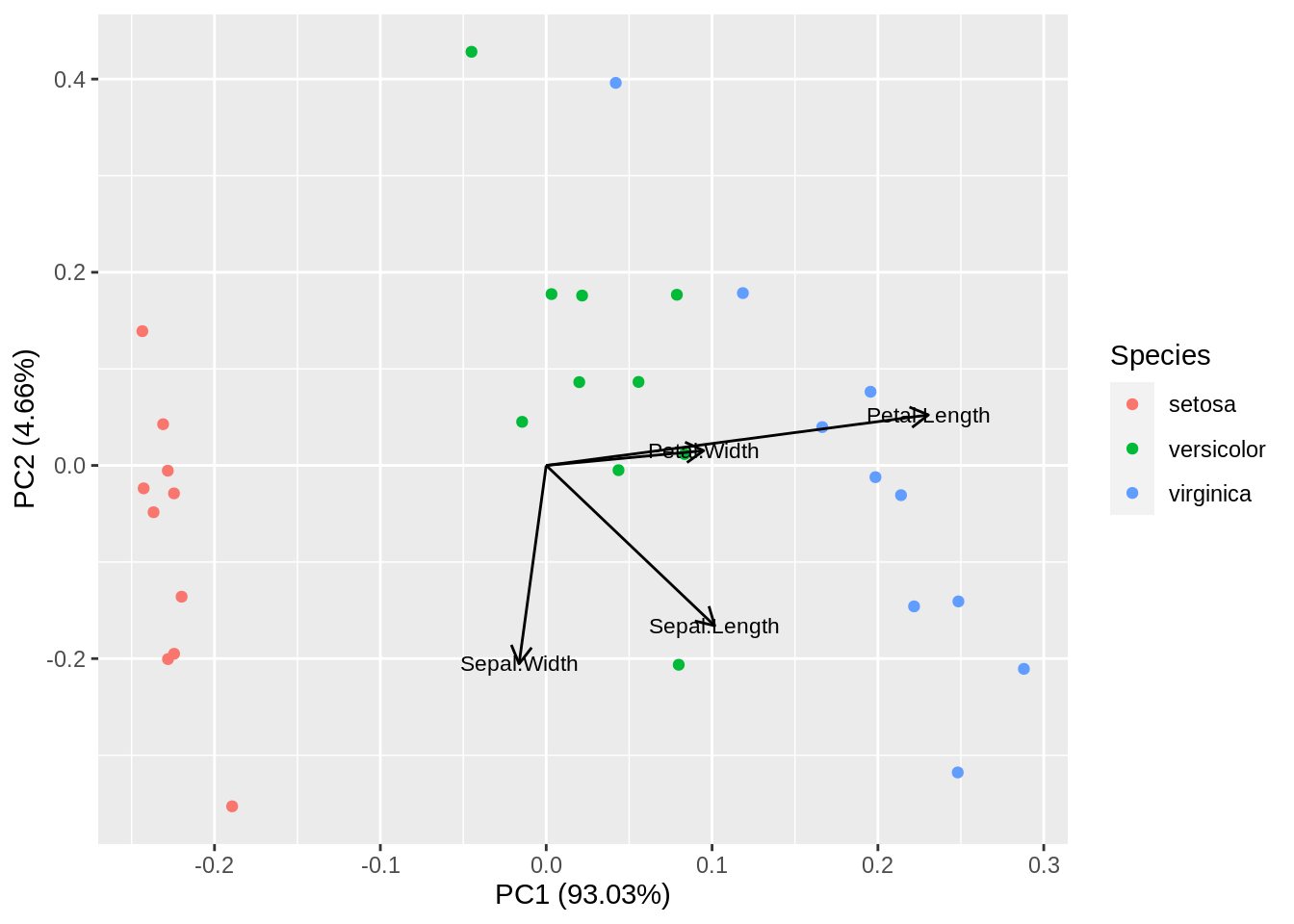
A plot of this type is called biplot because it shows both the observations and the original variables together. In fact, we have projected the whole four-dimensional data set and its coordinate system onto a two-dimensional space that, among all possible projections, is optimal in several ways. First, it reproduces the data almost without loss, since it captures most of the total variance. Second, the first dimension provides the best way to discriminate between the three iris species.
Let us go for a tentative, do-it-yourself PCA. It will take four rows of code (admittedly, the plot will not be so pretty):
m = scale(as.matrix(ir[,-5]), center=TRUE, scale=FALSE)
s = svd(m, 2, 2)
plot(s$u %*% diag(s$d[1:2]), asp = 1, xlab = 'PC1', ylab='PC2')
arrows(0, 0, s$v[,1], s$v[,2], length=0.1, angle=10, col='red') 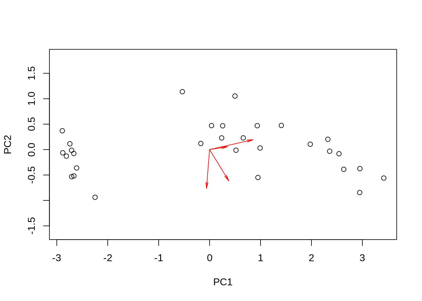
It is very similar, except that the arrows came out a bit shorter. You have seen what I did, and we don’t know exactly what R did, so let us get back to this a bit later.
Since SVD is so useful, let us take a closer look at it. It has been proven that any rectangular matrix, \(\mathbf{X}_{n\times m}\), can be approximated with the product of two orthonormal matrices, \(\mathbf{U}_{n\times r}\) and \(\mathbf{V}_{m\times r}\), and a diagonal matrix, \(\mathbf{D}_{r\times r}\), in the following way: \(\mathbf{X}=\mathbf{U}\mathbf{D}\mathbf{V}'\). Orthonormal means \(\mathbf{U'U}=\mathbf{V'V}=\mathbf{I}\), implying that the columns of both \(\mathbf{U}\) and \(\mathbf{V}\) are mutually independent or perpendicular, depending on whether you ask a statistician or a geometrician, and the sum-of-squares for each of their columns is 1.
We can choose any \(0<r\leq\min(n,m)\). It is standard practice to arrange the three matrices such that the diagonal elements of \(\mathbf{D}\) appear in descending order of magnitude: \(d_{11}\geq d_{22}\geq\ldots \geq d_{rr}\). Some of the \(d_{ii}\) may be zero or very close to zero, which means that the rank of the original matrix, \(\mathbf X\), is less than \(r\). Whatever admissible \(r\) we choose, the product, \(\mathbf{U}\mathbf{D}\mathbf{V}'\), provides the best possible approximation to \(\mathbf X\) in the least-squares sense, as compared to any other \(n\times m\) matrix of rank \(r\). If we choose \(r\) to be equal to the actual rank of \(\mathbf X\), the approximation is perfect.
The SVD was not invented with the specific purpose to provide an alternative way to compute PCA, the way we did above and will revisit later. This is just one job at which it excels. SVD is broader and simpler simultaneously: a way to decompose and reconstruct a (data) matrix in an organized way, starting with the most important, gradually adding news insights without a need to revise what we have learnt before, detect or possibly remove disturbing details or random noise. It is just as useful in, say, image processing as it is in data analysis.
Let us take a closer look at how the original matrix is reconstructed and approximated:
\[\mathbf{X}=\mathbf{U}\mathbf{D}\mathbf{V}'=d_{11}\mathbf{u}_{1}\mathbf{v}_1'+d_{22}\mathbf{u}_2\mathbf{v}_2'+\ldots +d_{rr}\mathbf{u}_r\mathbf{v}_r'\]
Note that this is probably not matrix multiplication the way you studied it at school. The matrix product, \(\mathbf C=\mathbf{AB}\), that appears to be taught most often represents each element of the result, say \(c_{ij}\), as the inner product of the \(i\)-th row of \(\mathbf A\) with the \(j\)-th column of \(\mathbf B\). Here, the product is represented as the sum of \(r\) matrices of size \(n\times m\), each of which is the outer product of two vectors. The role of the diagonal matrix of singular values, \(\mathbf D\), is to scale each of the \(r\) matrices by a certain factor. Because we have arranged the singular values in decreasing magnitude, successive components contribute less and less to the sum. The \(n\times m\) matrix, \(d_{11}\mathbf{u}_{1}\mathbf{v}_1'\), is the best rank 1 approximation to \(\mathbf X\), \(d_{11}\mathbf{u}_{1}\mathbf{v}_1'+d_{22}\mathbf{u}_2\mathbf{v}_2'\) is the best rank 2 approximation, and so on: as we add more and more components, our approximation gradually improves.
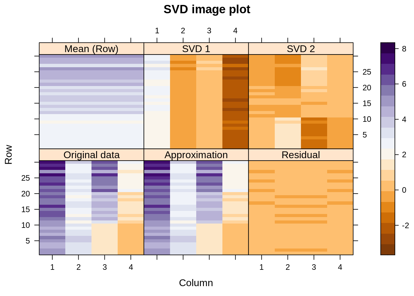
Let us visualize the decomposition – reconstruction process. Below we see image plots of the actual data matrix, the approximation thereof achieved by adding together the first three components, and the residuals. On top are shown the three components themselves.
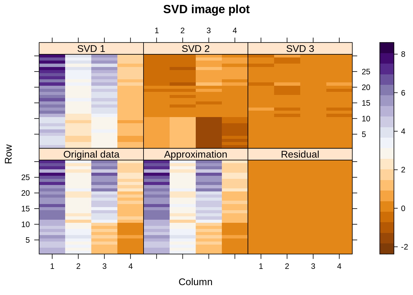
We see that the approximation to the original data is almost perfect (the singular values happen to be 9.1, 5.2, 2.2, and 0.6). In fact, the first component is already quite close, but the second one also captures some structure related to the three species, especially the way it adjusts variables 2 and 3 for the Setosa species (here shown at the bottom of each display — the “scales” actually represent case numbers and variable numbers).
This display was produced with SVD of the original data matrix without any centering at all. When we did the PCA, we applied SVD on the column-centered data. If we column-center the data matrix before SVD, then the column means play part in reconstructing the original data. We get:
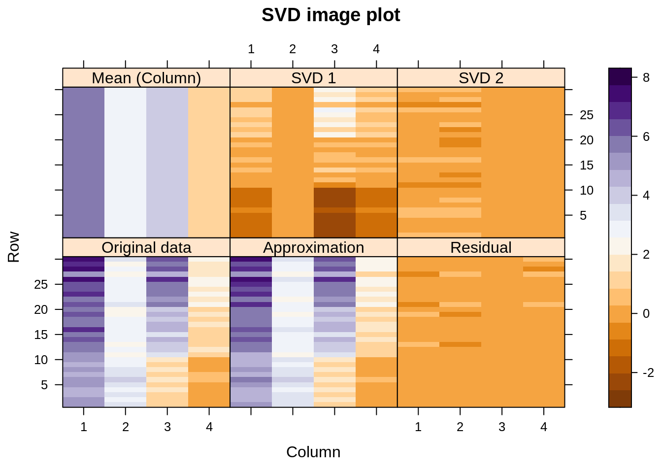
Again, the approximation is quite good, and it was achieved with only two SVD components (plus the additive effect of the column means). On the PCA biplot, we noticed that it took only one dimension, the first one, to distinguish between the three species. The same is observed here: SVD1 does the whole job by itself. In the version without any centering, it took us two SVD components to catch all the information about the species.
Is there anything to stop us from row-centering instead of column-centering the data? Certainly not, but it might not be the best idea:
Again, the approximation to the original data is good (how couldn’t it be? four variables, two SVD components\(\ldots\)) but notice how the first SVD component must do the job of the column-wise centering that would have been more appropriate, and everything interesting with regard to differences between species moves to SVD2.
Finally, the SVD of a double-centered matrix, which means subtract the column means, subtract the row means, and add back the overall mean:
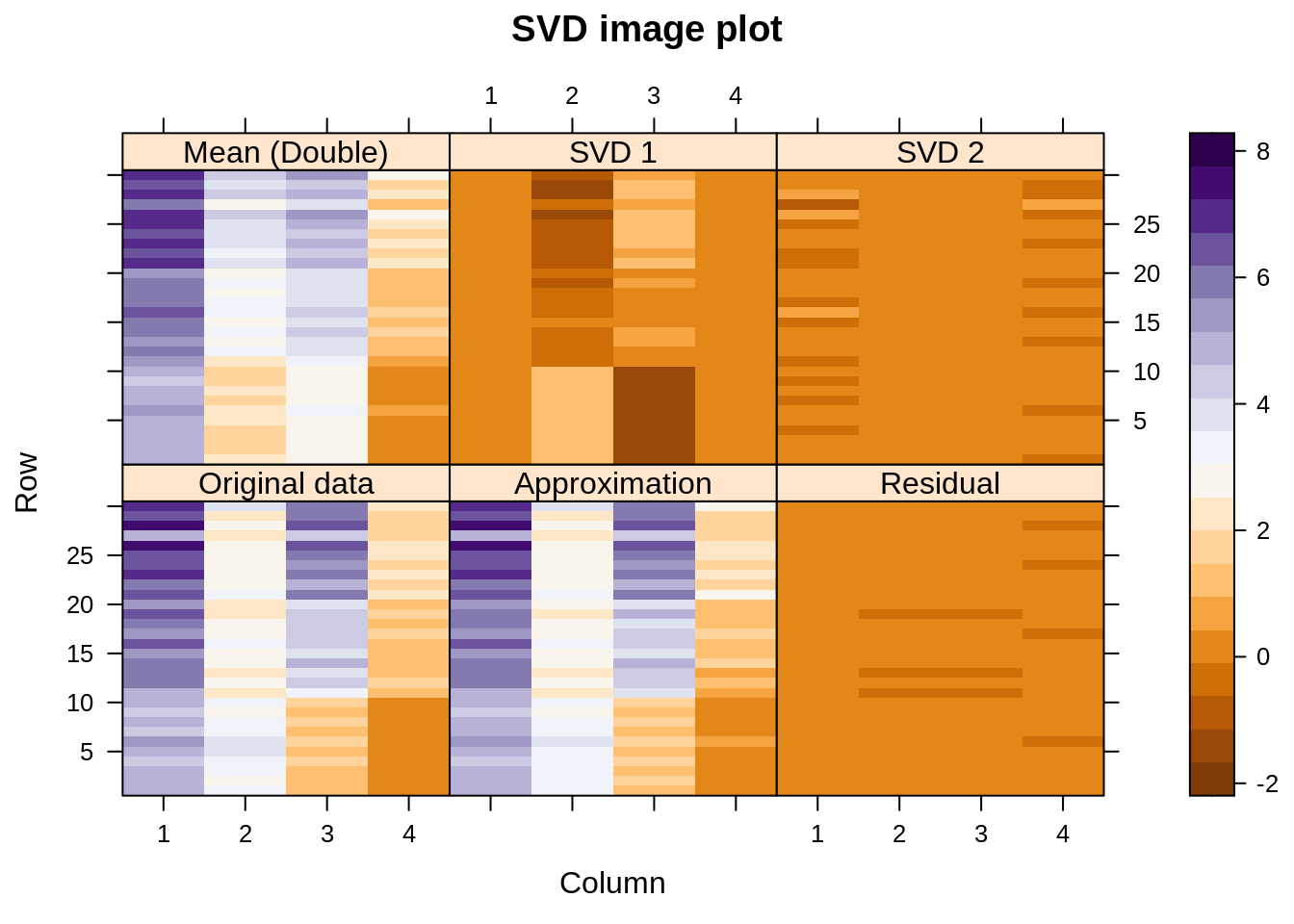
We see something very similar to the first display, but the job done there by SVD1 is now overtaken by the double-centering. We have a very similar model for the original data, except that the row and column effects are handled a bit differently.
Now back to geometry. The PCA biplot is not the only possible one but, for historical reasons, it is the the best known. PCA was invented by Pearson in 1901 and later by Hotelling in the 1930s, while SVD was made popular by Eckart and Young in 1936, and the algorithm used today dates back to 1970. The statisticians who proposed PCA wanted to place their data cloud with the centroid at the origin of the coordinate system, then rotate it such that the first dimension catches the largest variance, the second dimension the second largest variance, etc. They achieved this by an eigendecomposition of the covariance matrix. If we want to do the same with SVD, column-centering the data matrix is imperative because this is how a covariance matrix is defined: no centering, no covariance.
By the way, the PCA I did is equivalent to an eigendecomposition of \(\mathbf{Y'Y}\) with \(\mathbf Y\) the column-centered version of \(\mathbf X\). This is \(n\) or \(n-1\) times the covariance matrix, depending on whether one prefers the maximum-likelihood or the unbiased version (\(n\) is the number of observations). This explains the different length of the arrows in my display, and my relative lack of enthusiasm to get it exactly right. There are two PCA functions in base R, and I always forget which one uses \(n\) and which \(n-1\).
PCA can also be done on the correlation matrix; to get the same result with SVD, I would have to not only center the columns of \(\mathbf X\) but also scale them to have unit variance. I will not pursue this line here for three reasons: it has received more attention in the literature, I don’t want the number of my plots to explode, and a correlation version does not make sense for the particular application in which I am interested at the moment (but it might make a lot of sense for your application).
Let us now write some slightly better functions to do biplots, and use them to show the impact of the different centerings. First, put the plotting in a separate function so it won’t distract us:
showit=function(s, f, g, x=1, y=2, ...){
  scr = 100*s$d^2 / sum(s$d^2)
  plot(rbind(f[,c(x,y)], g[,c(x,y)]),
     xlab=paste0('PC ',x,' (',round(scr[x],1),'%)'),
     ylab=paste0('PC ',y,' (',round(scr[y],1),'%)'),
     type='n', asp=1,  ...)
  arrows(0, 0, g[,x], g[,y], length=0.1, angle=10, col='lightgray')
  text(g[,c(x,y)], labels=colnames(m), cex=.6, col='steelblue')
  text(f[,c(x,y)], labels=rownames(m), cex=.6, ...)
}

overallmean = function(x){0*x + mean(x)}

columnmean = function(x){tcrossprod(rep(1, nrow(x)), colMeans(x))}

rowmean = function(x){tcrossprod(rowMeans(x), rep(1, ncol(x)))}

doublemean =  function(x){columnmean(x) + rowmean(x) - overallmean(x)}
s is the output of the svd function, here used only to compute the percentage of variance explained by each component. I will compute the coordinates of the rows, f, and the coordinates of the columns (the ones shown with arrows), g, myself. x shows which component to plot on the horizontal axis, and y which component to plot on the vertical axis. The four other functions create explicitly matrices of the overall mean, the column-wise means, the row-wise means, and the row-and-column means (I could have used R tricks, but I wanted to be explicit).
Without any centering:
m = as.matrix(ir[,-5])
s = svd(m)
f = s$u %*% diag(s$d)
g = s$v
showit(s, f, g, main='No centering')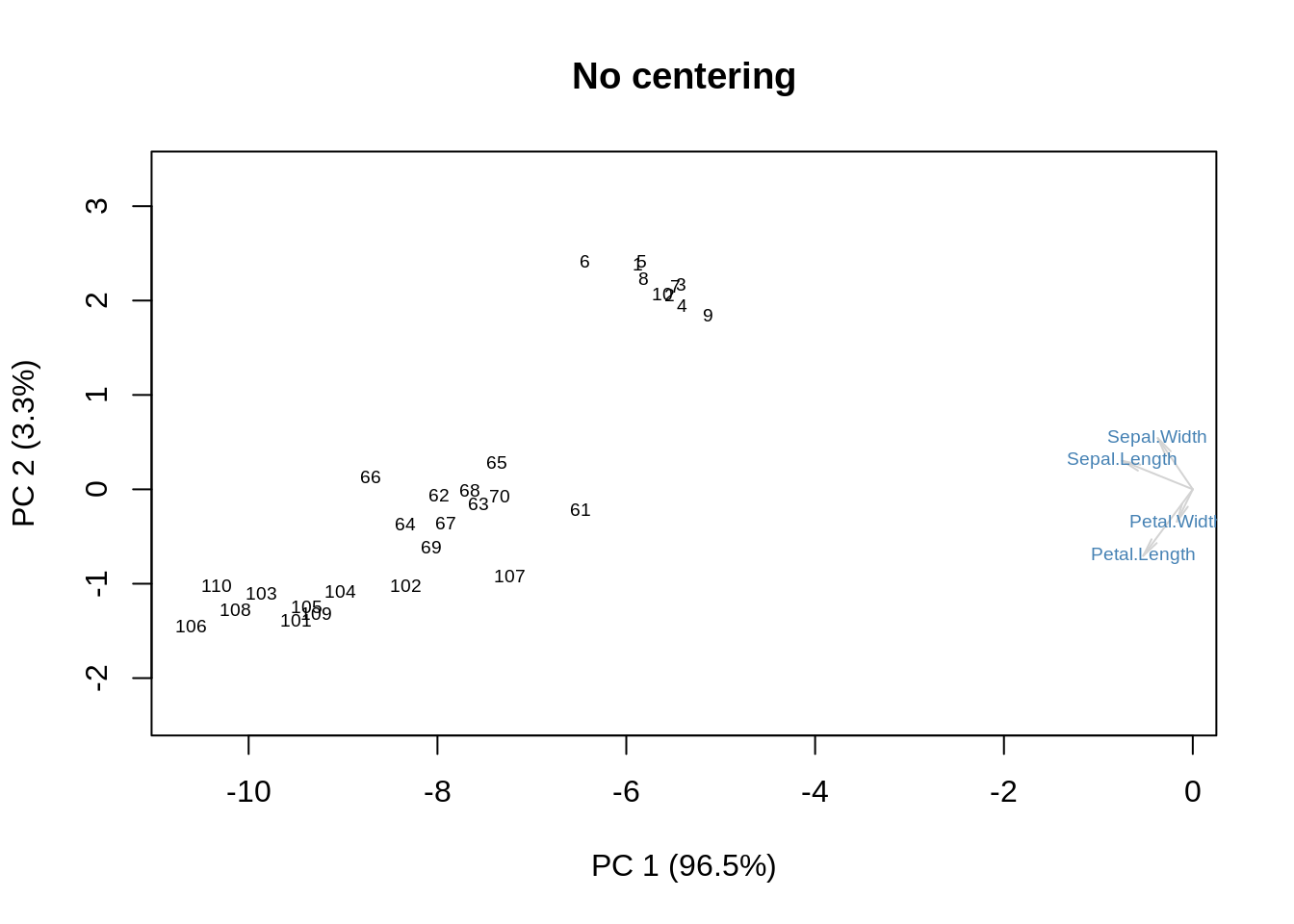
We get some additional information on the means. Now, column-centering will remove the means and place the origin at the centroid:
m = as.matrix(ir[,-5])
m = m - columnmean(m)
s = svd(m)
f = s$u %*% diag(s$d)
g = s$v
showit(s, f, g, main='Column centering')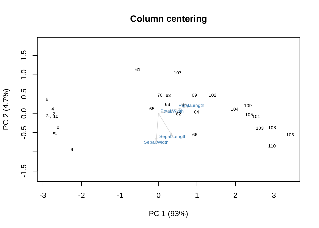
Row centering then does something on its own:
m = as.matrix(ir[,-5])
m = m - rowmean(m)
s = svd(m)
f = s$u %*% diag(s$d)
g = s$v
showit(s, f, g, main='Row centering')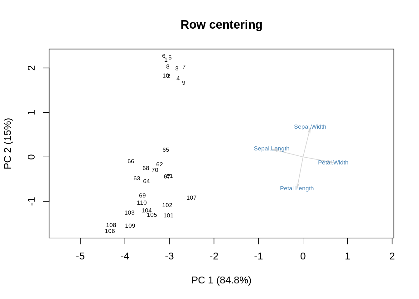
Finally, double-centering combines the effects of row-centering and column-centering:
m = as.matrix(ir[,-5])
m = m - doublemean(m)
s = svd(m)
f = s$u %*% diag(s$d)
g = s$v
showit(s, f, g, main='Double centering')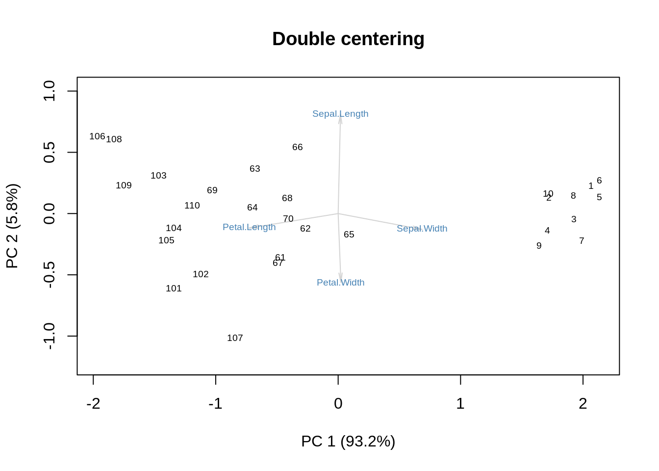
One could argue that this variation of the biplot strips away the role of size to concentrate on shape. We can get a similar effect by performing SVD without centering and then discarding the first SVD component:
m = as.matrix(ir[,-5])
s = svd(m)
f = s$u %*% diag(s$d)
g = s$v
showit(s, f, g, x=2, y=3,
       main='No centering, second and third components')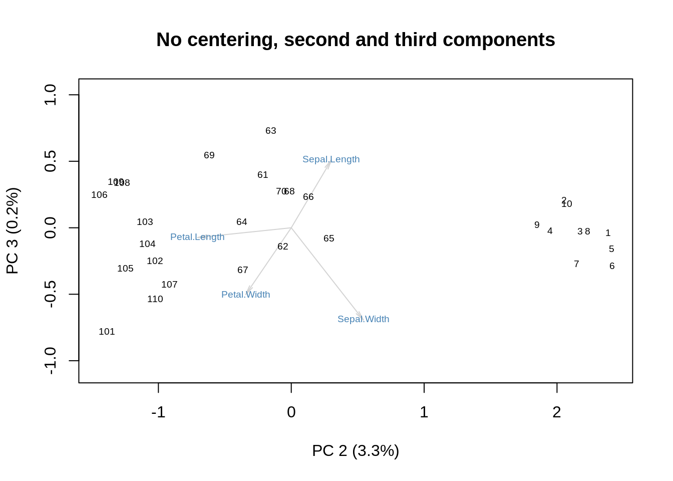
Even the variance explained by the two axes is to proportion: \(3.3/0.2 \approx 93.2/5.8\approx 16\).
Can you see the correspondence between these graphical displays and the image plots shown before? Which kind would you prefer to make sense of your data?
At this point, I have said most of what I wanted to say, but there are a couple of further details worth mentioning. The first one has to do with how we plot the row coordinates (the observations) as \(\mathbf{UD}\) and the column coordinates (the variables) as \(\mathbf V\). \(\mathbf{UD}=\mathbf{XV}\), so what we are plotting is the projection of the original data onto the new coordinate system given by the orthonormal matrix, \(\mathbf V\). This projection approximates the inter-point distances between the rows of \(\mathbf X\), so it is called ‘row metric preserving’. Here it is, again, for the uncentered \(\mathbf X\):
m = as.matrix(ir[,-5])
s = svd(m)
f = s$u %*% diag(s$d)
g = s$v
showit(s, f, g, main='No centering, row-metric-preserving')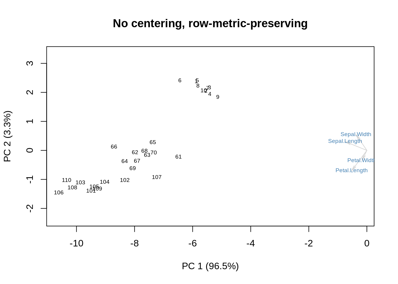
Alternatively, we can multiply \(\mathbf D\) with \(\mathbf V\), and leave \(\mathbf U\) alone. This is the column metric preserving version:
m = as.matrix(ir[,-5])
s = svd(m)
f = s$u
g = diag(s$d) %*% s$v
showit(s, f, g, main='No centering, column-metric-preserving')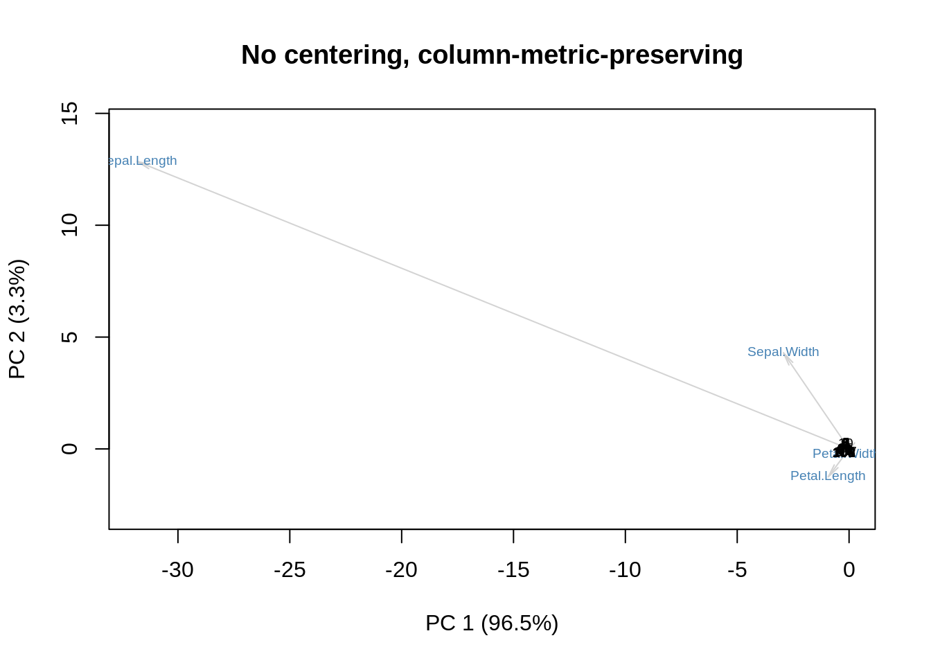
Sometimes \(\mathbf D\) is spread between rows and columns, yielding a display that does not have a clear geometric interpretation: its only merit is that it may be easier to examine. In the following example, \(\mathbf D\) is spread equally:
m = as.matrix(ir[,-5])
s = svd(m)
f = s$u %*% diag(sqrt(s$d))
g = diag(sqrt(s$d)) %*% s$v
showit(s, f, g, main='No centering, no-particular-metric-preserving')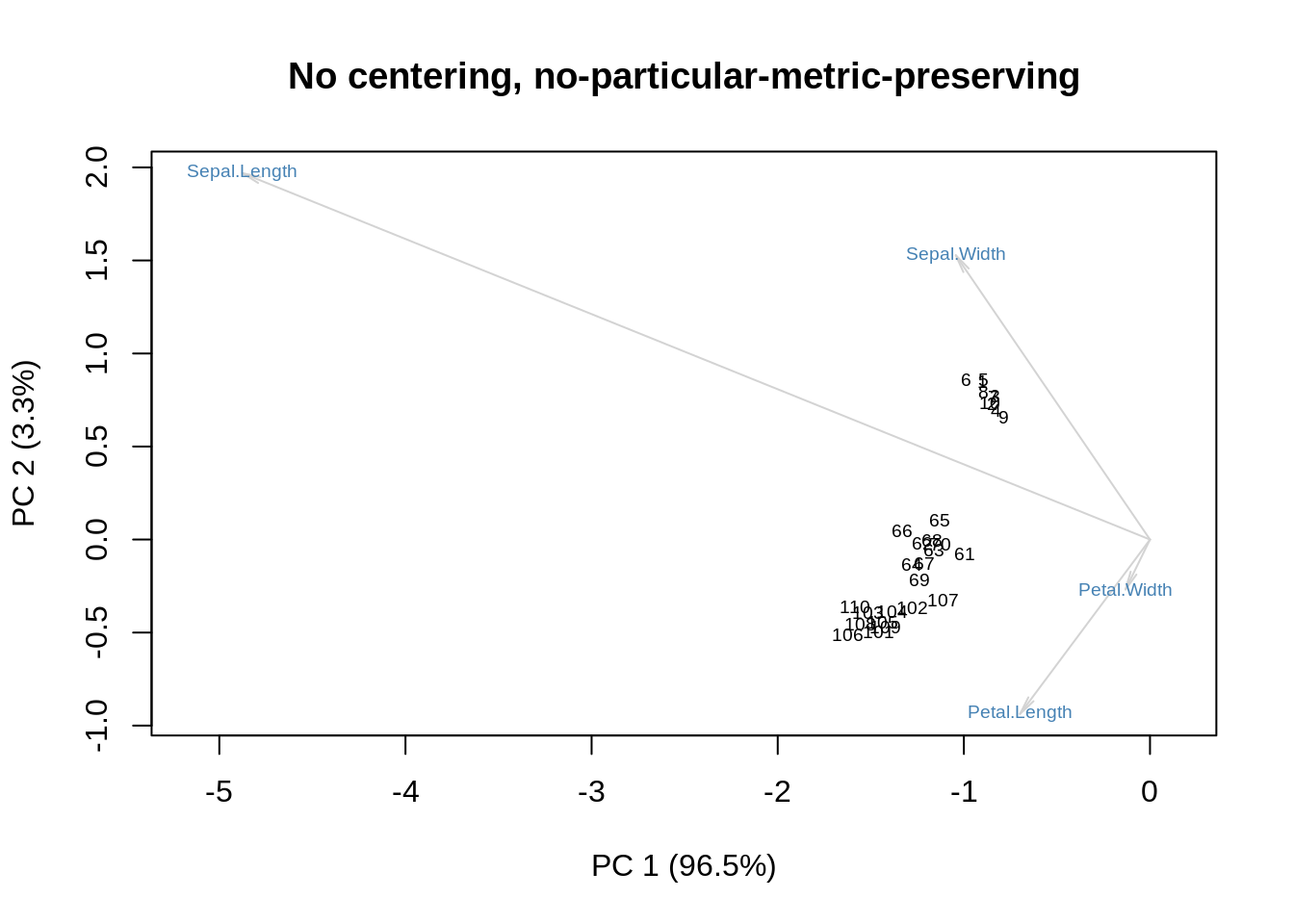
Of course I can repeat all this with column-centering, row-centering, and double-centering, but I want to be gentle.
The last point is also a bit confusing, but here it is: the original biplot developed by Gabriel back in 1971 divides the data matrix, \(\mathbf X\), by \(\sqrt{rc}\) where \(r\) is the row dimension and \(c\) is the column dimension of \(\mathbf X\). Later, the coordinates of the rows are multiplied by \(\sqrt r\) and the coordinates of the columns are multiplied by \(\sqrt c\). To show the effect of this, I will redo the last three plots with this normalization on (again omitting the column-, row-, and double-centered forms), and then we can all go home.
m = as.matrix(ir[,-5])
r = nrow(m)
c = nrow(m)
m = m / sqrt(r*c)
s = svd(m)
f = sqrt(r) * s$u %*% diag(s$d)
g = sqrt(c) * s$v
showit(s, f, g, main='Row metric preserving biplot')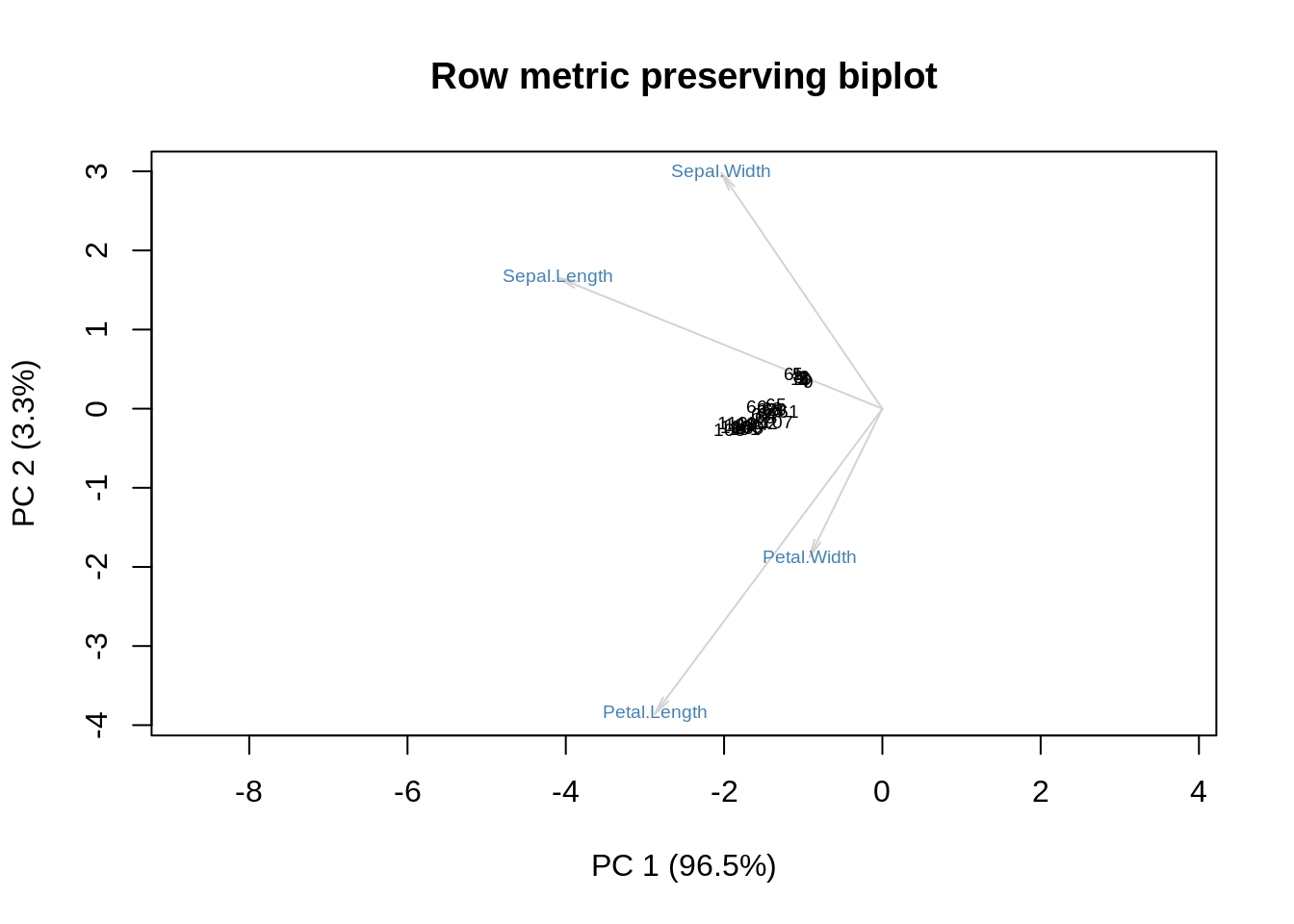
m = as.matrix(ir[,-5])
r = nrow(m)
c = nrow(m)
m = m / sqrt(r*c)
s = svd(m)
f = sqrt(r) * s$u
g = sqrt(c) * diag(s$d) %*% s$v
showit(s, f, g, main='Column metric preserving biplot')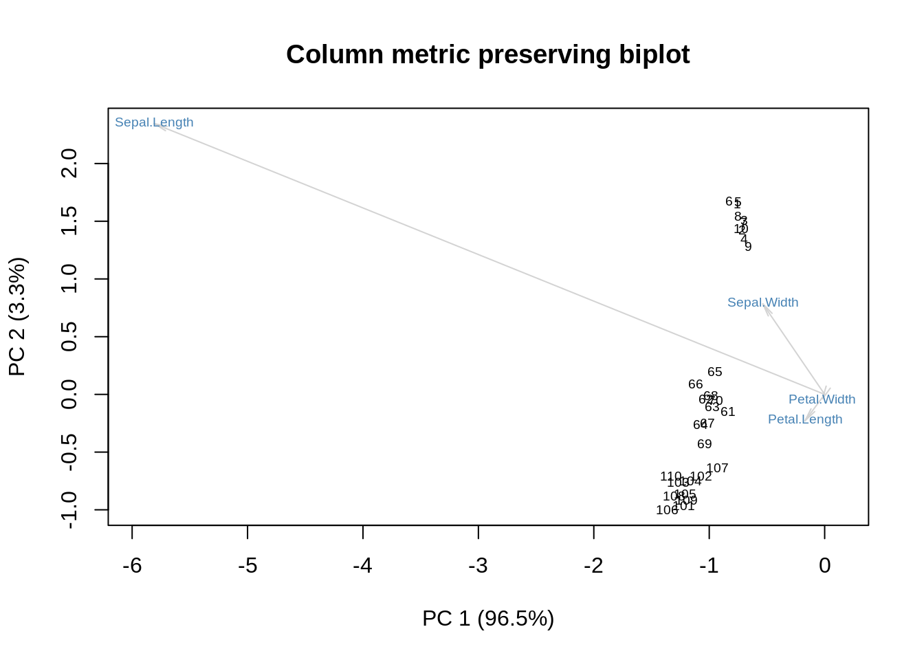
m = as.matrix(ir[,-5])
r = nrow(m)
c = nrow(m)
m = m / sqrt(r*c)
s = svd(m)
f = sqrt(r) * s$u %*% diag(sqrt(s$d))
g = sqrt(c) * diag(sqrt(s$d)) %*% s$v
showit(s, f, g, main='Our last biplot for today')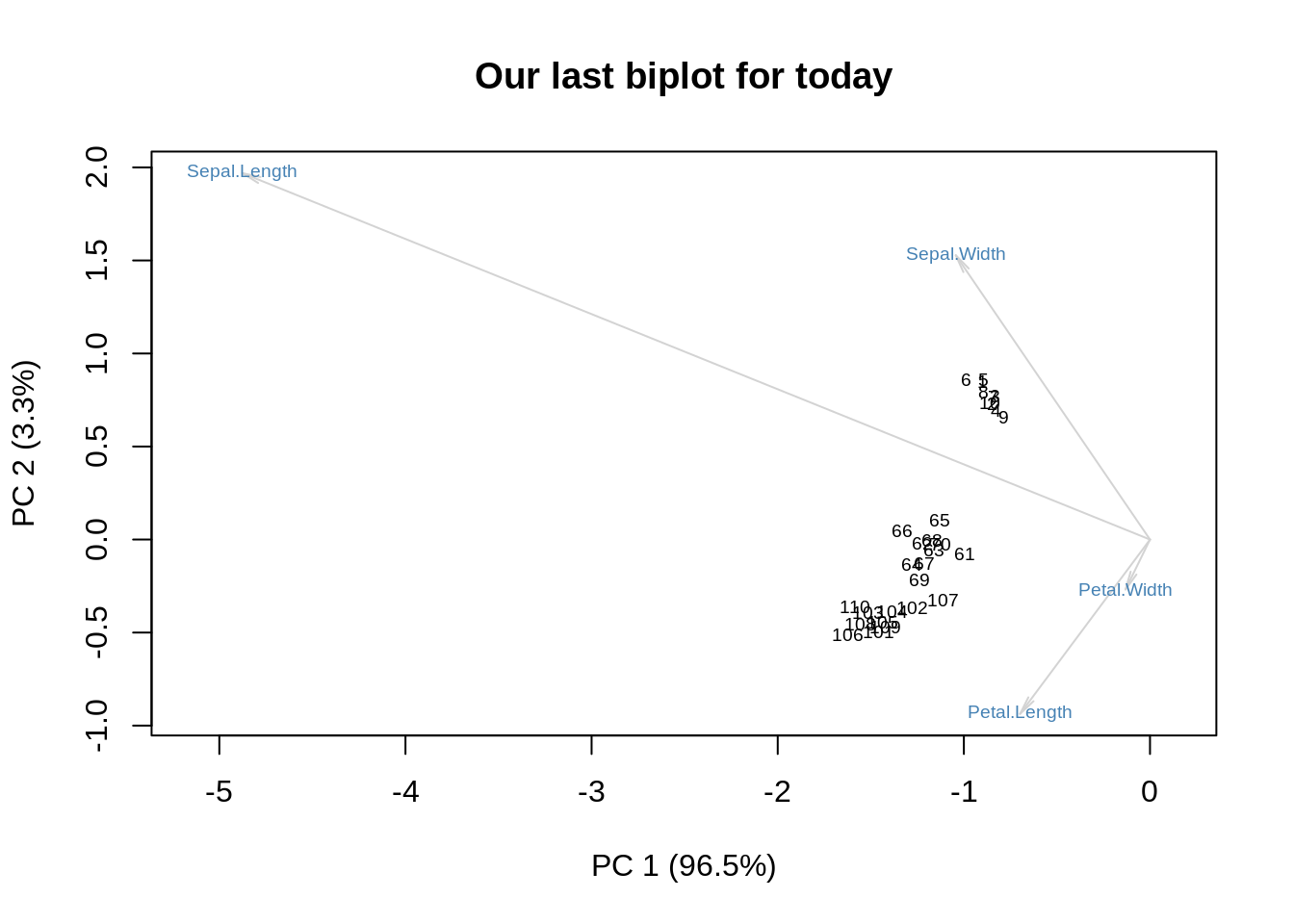
Acknowledgments This is a tutorial, so no references: all the background information can be found on Wikipedia. The image plots of the SVD come from a paper by Lingsong Zhang, which won the JASA student paper award in 2005.